Gradually, as Brice worked and reworked them, the laconic motifs that he calls subject references became simpler, more totemic and abstract. As their visual impact gained potency, their symbolic significance became more far-reaching and evocative. For example, in a 1982 Notation several of these symbols prompt the viewer to consider the life-giving properties of sea and land and man’s urge to anthropomorphize and deify these elements of nature. The central motif of this composition is a geometrized female figure that has the simplified elegance of a Cycladic idol of the second millennium B.C. This deity figure is submerged beneath rippling blue waves contained by carved stone fragments of aqueduct conduit, which are themselves surrounded by the azure waters of the Aegean. The goddess’s prominent female features, especially her spherical abdomen, emphasize her fertility. She is positioned so that her rotund belly falls in the exact center of the composition. Above this figure, in a register colored in earth tones, is another group of subject references that allude to animist reverence and worship. A gathering of circle, line, and triangles in the center is the pictographic symbol of another woman, this one in a supine position. By overdrawing in red and adding minimal hatching, the artist gave these lines a shallow dimension, as if they were incised in stone. Again pronounced breasts and stomach emphasize the figure’s sex and fecundity. To the right of this pictograph is an almost architectural form in the shape of an inverted T borne on a pair of spherical supports, representing the male element. Superimposed on it is a liquid mass in red that may suggest a flickering flame or perhaps a splash of oil, two ways in which this lingam might have been venerated in ancient ritual. Opposite, at the upper left, is a gray vessellike form, roughly the shape of a Greek amphora or hydria. Its swelling belly is marked by a navel and surrounded by a circle of blue, symbolizing the life-giving, perhaps consecrated, water that it holds. At the top of the composition is a red, starlike rose, its central spiral spinning out into delicate, radiating petals. Perhaps symbolic of prosperity or the brevity of life, this motif also has personal significance in Brice’s art, and like all of the subject references described here, it recurs frequently in his work.
This reading of the iconography of Brice’s drawing is admittedly subjective, yet it is clear that he consciously packed such images with many layers of allusion. This drawing is one of a series of forty-eight Notations produced in 1982, which are now in the collection of the Los Angeles County Museum of Art. Originally created as studies for Brice’s paintings, each of these drawings was assembled from groups of rougher sketches in which component motifs were developed and refined. As such, they exemplify the visual repertoire that the artist commands when he comes to a printmaking project.
In 1985 Kathan Brown, the master intaglio printer and proprietor of Crown Point Press, invited Brice to make collaborative prints at her burgeoning workshop in San Francisco. Long impressed by the artist’s paintings and drawings, Brown intended that he should translate this imagery into color intaglios. Beginning in early September, Brice worked from a handful of his color sketches to plates of the same scale, collaborating chiefly with master printer Hidekatsu Takada. Laboring incessantly through several workdays that stretched into nights, Brice and his collaborators made six color prints that combined etching, soft-ground etching, and aquatint.
These first Crown Point prints share the imagery and visual effects of Brice’s paintings and drawings of the period. For example, the three compositional elements in one of these untitled prints are closely related to the LACMA Notations. Fractured sculptural forms derived from Cycladic heads and the torsos of Archaic-style kouroi are juxtaposed with dolmenlike slabs, marmoreal cylinders, and spheres.
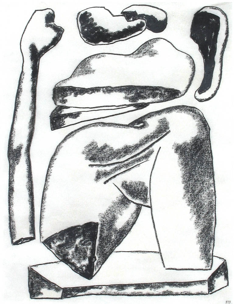
fig 9. William Brice, Untitled, 1973
compressed charcoal, 24 x 19 in.
Collection of Artist.
Generally Brice favored elementary techniques, as if striving for a thorough understanding of the processes and effects available to him. He exploited the nervous richness of heavily bitten line and evanescent clouds of color aquatint. This direct method, combined with simplicity of design, marked similarities between Brice’s prints and the intaglios of Joan Miró. The visual sensation of superimposition is important in these works, and the artist labored to achieve precise, layered passages of aquatint that suggest mottled, stony surface textures. As his knowledge of printmaking grew and he recognized the technical possibilities offered by different intaglio processes, Brice became freer in his approach. He soon found that his experiences in printmaking were influencing his drawing and painting.
Unusual among the early Crown Point prints is a striking little aquatint in which Brice concentrated on bold, flat areas of form and color rather than on line. Before a stratified background of black and gray stand two bright scarecrows constructed of sculptural and architectural fragments that are familiar from the Notations. The figure on the right is surmounted by a twisting guilloche that symbolizes a bovine head. The vivid composition is again reminiscent of Matisse’s cutouts, especially its passages of flat, almost unmodulated color with ragged edges. While this print demonstrates Brice’s facility with formal abstraction and his ability as a colorist, it lacks the associative impact of his other works. The artist generally abandoned this direction in his later prints.
The following year Brown asked Brice to participate in the Crown Point Press Japanese woodcut program. The artist was invited to create a design that would be transformed into a color woodcut by masters of the centuries-old tradition of ukiyo-e. He would visit Japan to work with the printer on the final stages of proofing and printing. Intrigued and excited, Brice approached Takada, who served as the program’s liaison, with questions about the process, in order to utilize to best advantage the inherent qualities of the medium. Takada explained that the Japanese method used transparent water-based inks. Thus, while the printers could easily achieve gossamer effects of translucency, saturated, opaque passages were more difficult. Brice realized that he should develop the image for his print in a sympathetic medium. He began experimenting with watercolor, a medium that he had not used in nearly thirty years, and found that the process allowed him wonderful subtleties of gradation, which he strove to balance with complexity of pattern.
The image that Brice ultimately produced as the model for his woodcut juxtaposes the solidity of rock with the mutability of water, inviting the contemplation of geophysics. Perhaps this reverie was sparked by the artist’s use of unaccustomed materials. His familiar boulderlike forms seem almost to hover in space, their shapes, sizes, and interstices carefully balanced. Some of these rocks were formed by eons of geological activity, while others seem to have been carved relatively recently by ancient man. These weighty forms are arranged before a reticulated field that Brice executed by painting delicate stripes of watery washes and allowing the ink to pool in rivulets in the cockled paper. In his sketches and paintings of the period the artist had also been exploring images of the earth’s geological and weather systems, especially the cyclical movement of life-giving water. He visualized a diagrammatic landscape in cross section, with mountains behind forests and with oceans in the foreground. As water rises to the clouds above this landscape, it floats in layers in the sky, later falling as rain on the earth below, then running down toward the sea, flowing in rivers through verdant forests and seeping through many geological strata to the ocean. After working and reworking this image, Brice refined the idea into a synoptic plan that eliminated the landscape and represented only the water itself as it moves continuously through this system. This is the motif that appears in the top center of Kyoto. In the original watercolor this motif was rendered in blue, while the rest of the drawing was executed in gray washes mixed from diluted black ink.
Brice sent his watercolor to Japan, where the design was painstakingly transferred to blocks of linden wood, which were carved by the expert craftsman Shunzo Matsuda. Then the master printer Tadashi Toda pulled a proof, meticulously working from the original watercolor. This was presented to Brice upon his arrival in Kyoto on September 25, 1987. Toda had a strong sympathy for the piece and had found associations that were close to Brice’s own intentions. In the watercolor he saw affinities with traditional Japanese rock gardens, such as the famous garden at the temple of Ryoan-ji in Kyoto. Conceived to represent the vastness and beauty of nature in microcosmic scale, this sculptural garden comprises a collection of rocks carefully selected for their picturesque qualities and for their evocation of mountains. They are carefully placed on a flat tract of uninterrupted sand that is meticulously raked around the rocks in undulating patterns representing the ocean’s waves.